Today, people use websites on multiple different devices, including all size of devices. If your website does not look good design or work properly on every screen, visitors may leave within some seconds. This can output in lost customers and less business opportunities.
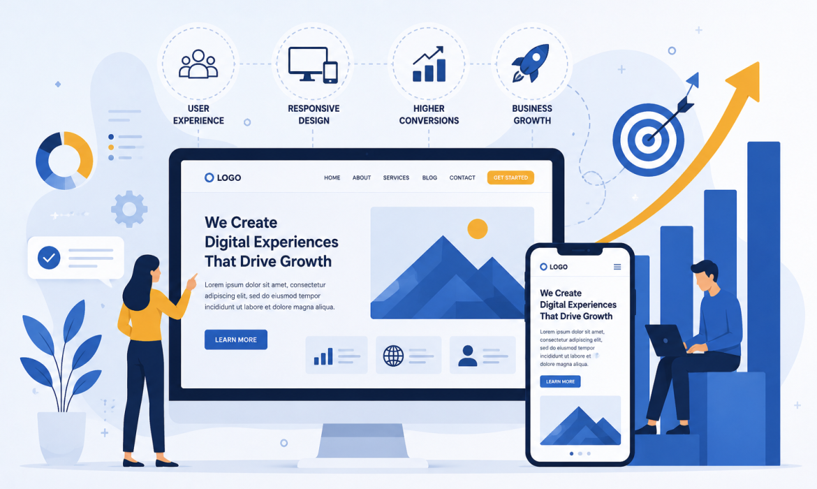
This is where responsive website front layout becomes more important for online business. A responsive website design automatically adjusts its layout, images and content to fit any screen size, giving every visitor a easy browsing simple and nice experience. For right now trandy updated businesses, having a responsive website is no long time optional—it’s essential.
What is Responsive Website Design?
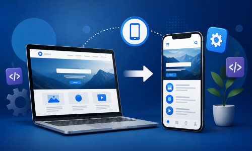
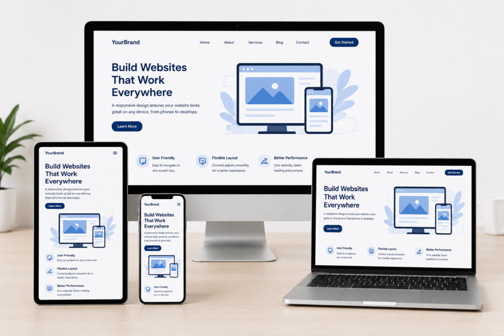
Responsive website design is a web development approach that allows a website to adapt to different screen sizes on devices. Instead of creating websites for mobile and desktop users, one responsive website works across all new devices.
Whether someone visits your website from a mobile phone, tablet, laptop or computer, they can easily read your content, navigate your pages and interact with your business.
How Does Responsive Website Design Work?
Responsive websites use workable layouts design, photos and coding new techniques that automatically adjust according to the customer’s screen all types of size.
The main elements of responsive design include:
- Flexible Layouts: The website adjusts fully automatically to all types of screen sizes.
- Mobile-Friendly Navigation: Menus become very simple to use on smaller screens.
- Optimized Images: Images resize without low quality or slowing down the website.
- Fast Loading Speed: Responsive websites are designed to very fast on all devices.
- Easy Reading Experience: Text remains more clear without zooming or other screen.
Benefits of Responsive Website Design
1. Better User Experience
Visitors enjoy browsing websites that are more fast and easy to use. A responsive website provides a easy experience on all device to stay long time peridos and explore other pages.
2. Improved Mobile Traffic
Most internet users now browse websites using their smart device. A responsive website ensures mobile visitors can easily access your all content, products and more services without any problem.
3. Higher Google Rankings
Google gives preference to mobile-useble websites in its search output. A responsive design improves your SEO working performance, helping your website rank more higher and organic visitors.
4. Faster Website Loading
People don't like waiting for very slow or breck websites. Responsive websites are optimized for speed, reduce bounce rates and improves overall customer satisfaction.
5. Increased Leads and Sales
When visitors can easily google your website, they are more like to contact your business, request a quote or complete a purchase. A good customer experience often leads to more conversion good rates.
6. Easier Website Management
Instead of maintaining separate desktop and mobile websites, you only manage one responsive website. This saves time, less maintenance costs and keeps your content very consistent across all type of devices.
7. Future-Proof Your Business
New devices and screen sizes continue to updateing the market. Responsive websites are built to adapt, helping your business stay ready for future update technology without requiring a complete new recreate.
Tips for Creating a Responsive Website
- Design your website with mobile device users in process mind.
- Keep navigation more easy to use.
- Optimize images to add on loading speed.
- Use readable fonts and good spacing.
- Test your website on all different devices.
- Improve page speed for a better custemor experience.
- Daily update your website to maintain performance and security.
Why Businesses Should Invest in Responsive Web Design
Your website is often the fully impression users have of your business. If visitors experience slow loading, navigation or poor mobile work performance, they may selected one of your business competitors instead.
A responsive website builds good trust, improves customer satisfaction, increases search engine more visibility, and helps your business grow online way. It is one of the smartest long-time investments any business can make.
Conclusion
Responsive website updated design is more than just making a website look easy on different devices. It helps add to boosts search engine rankings and supports business.
At Scrupulous Technology, we create modern, responsive websites that are more fast, secure and designed to deliver the best experience on all device. Whether you’re launching a new business online website or updateing your existing one, our team can help you create a professional online presence that real output.
Ready to build a responsive website for your business? Contact Scrupulous Technology today and let’s create a website that helps your business.